Case Study
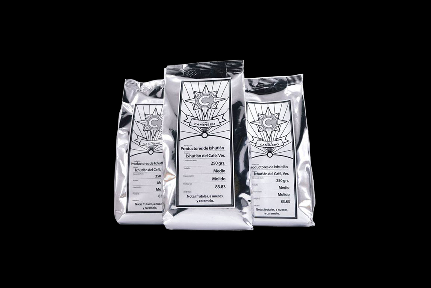
Café Caminero, an independent coffee producer recently founded for a young couple from Coatepec, México needed a brand able to reach and speak to the modern consumer that not just demands value in the product, but seeks a responsible experience around coffee consumption. The company focus on fair-trade standards and sustainable production across all the stages involved in their coffee production. As a result the brand stayed away of illustrated solutions or unnecessary decoration, graphic resources heavily used in the Mexican coffee industry for at least the last 2 decades; Even visually redundant aspects like the coffee bean were eliminated to enhance visual effect and reduce environment impact related to materials or inks. Some level of nostalgia was kept and implemented in the brand taxonomy as a way to reflect tradition and relevance. At the same time its color palette is minimal, making it easy to reproduce throughout different media and applications, and consistent with their ethos, keeping at minimum the environmental impact.
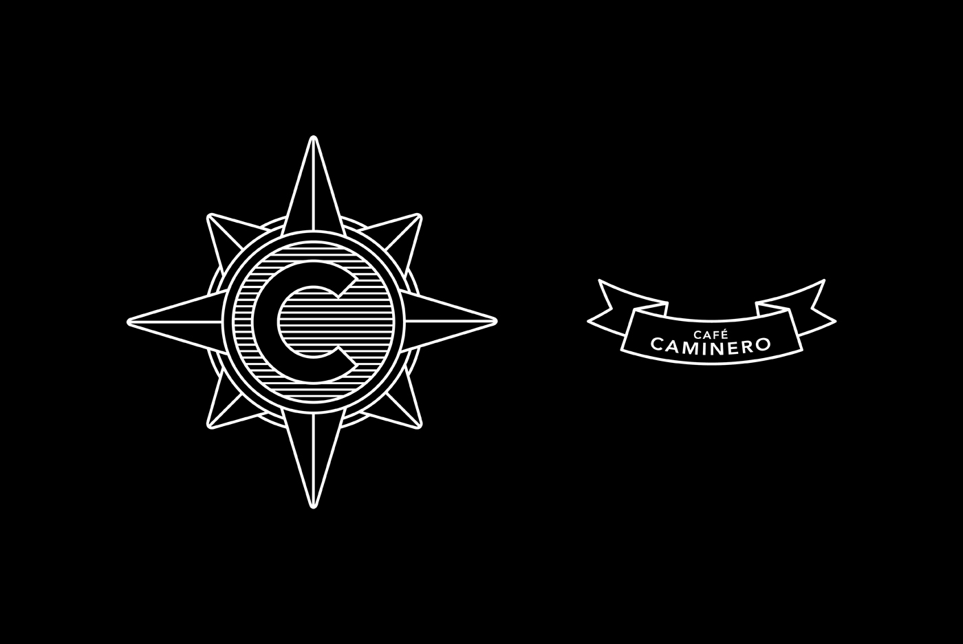
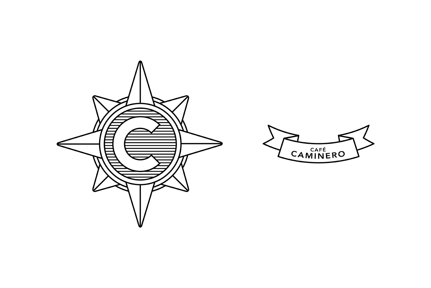
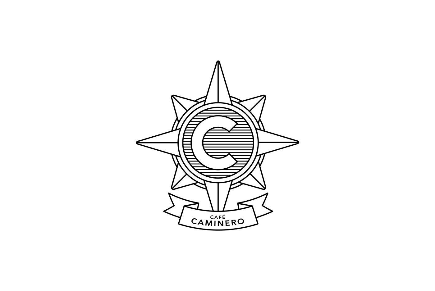
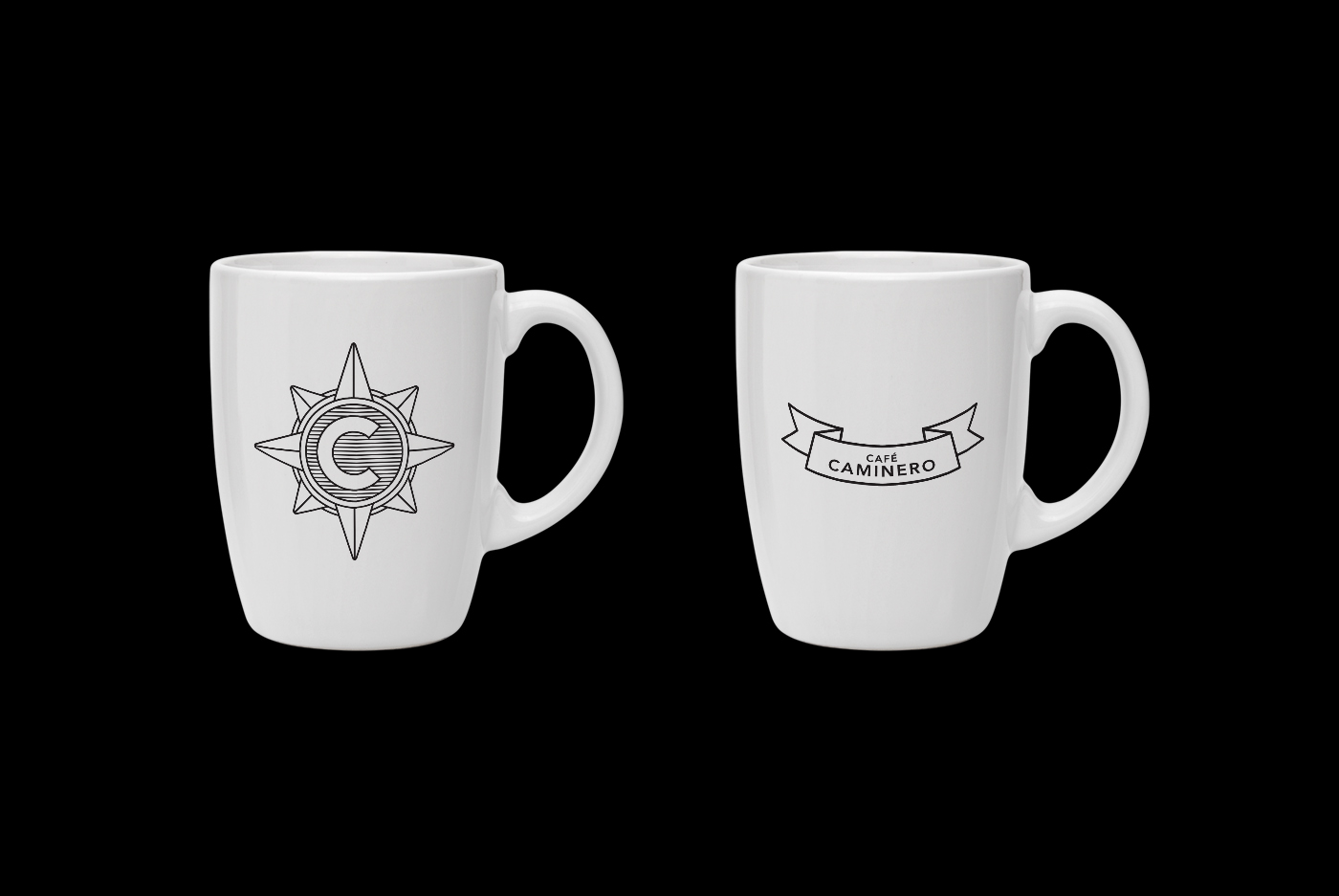
The logo is conformed by the symbol, the wind rose, a visual metaphor of the explorer on the search of new flavors, experiences and adventures, the visual brand also shows the “C”, a compact version of the company name. The word-mark and its use of typography and arrangements, along graphic elements conveys concepts like tradition and elegance.
