Case Study
With 24 years of trajectory as one of the most successful and well known language schools, Bristol sought out to create a new campaign that showed a fresh face to the public that already knew the school, yet trying to reach new students within the increasing competitive market of language schools in Mexico, the campaign needed to be able to adapt and scale in different formats across traditional and digital media, always keeping consistency and on brand message aligned to the core values that identify Bristol for almost a quarter of century.
The Message
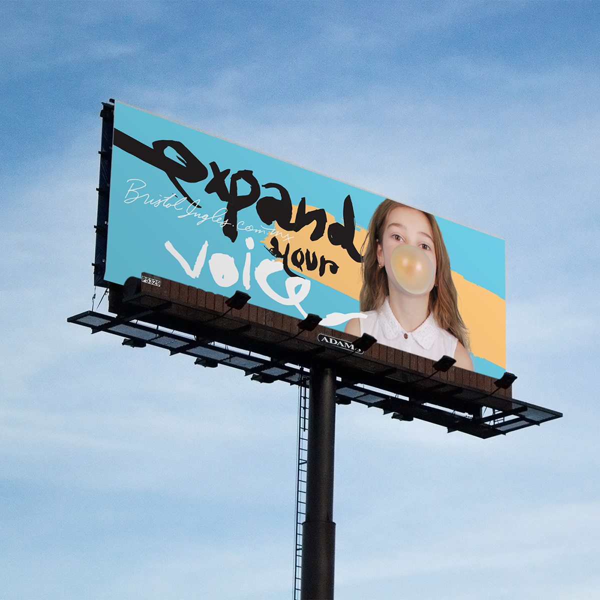
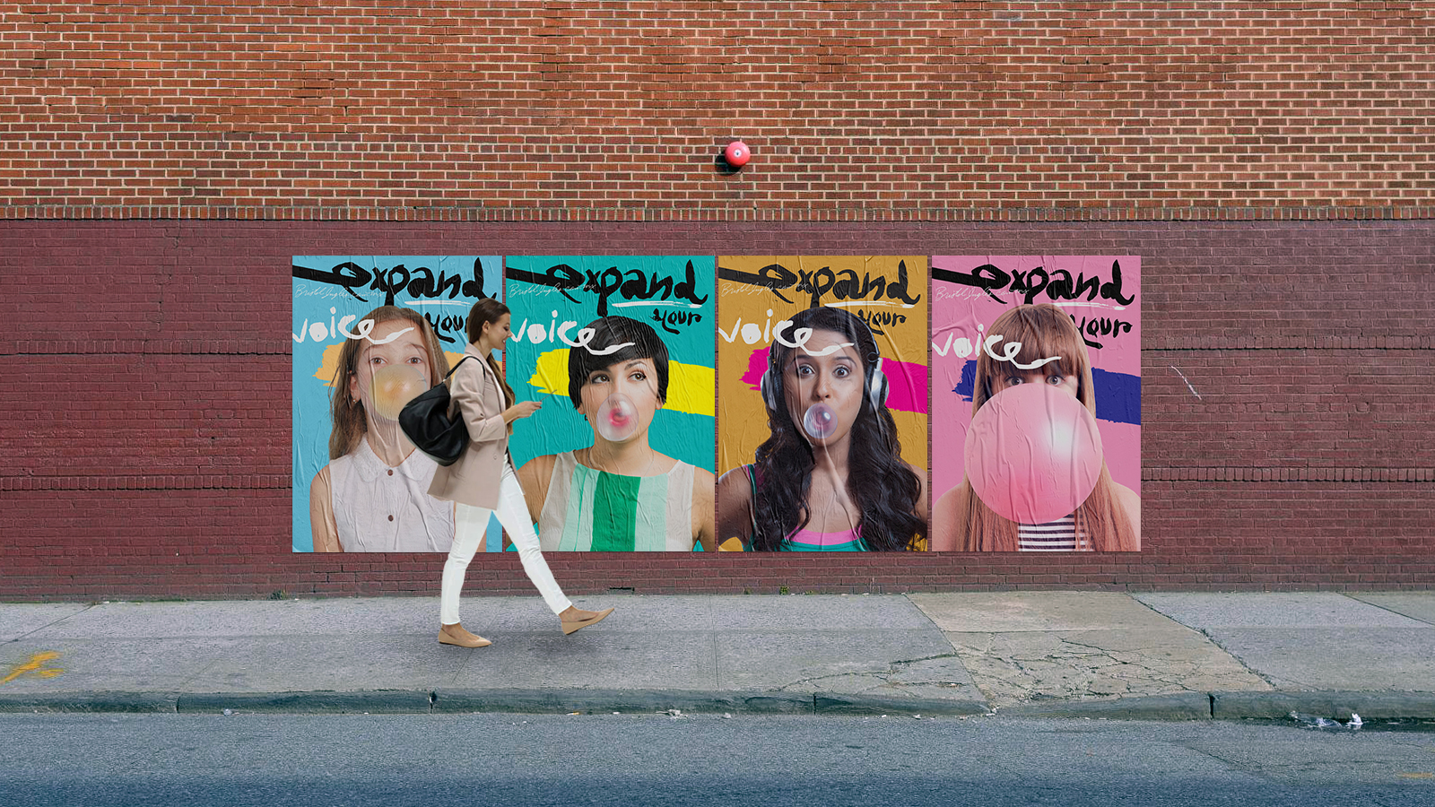
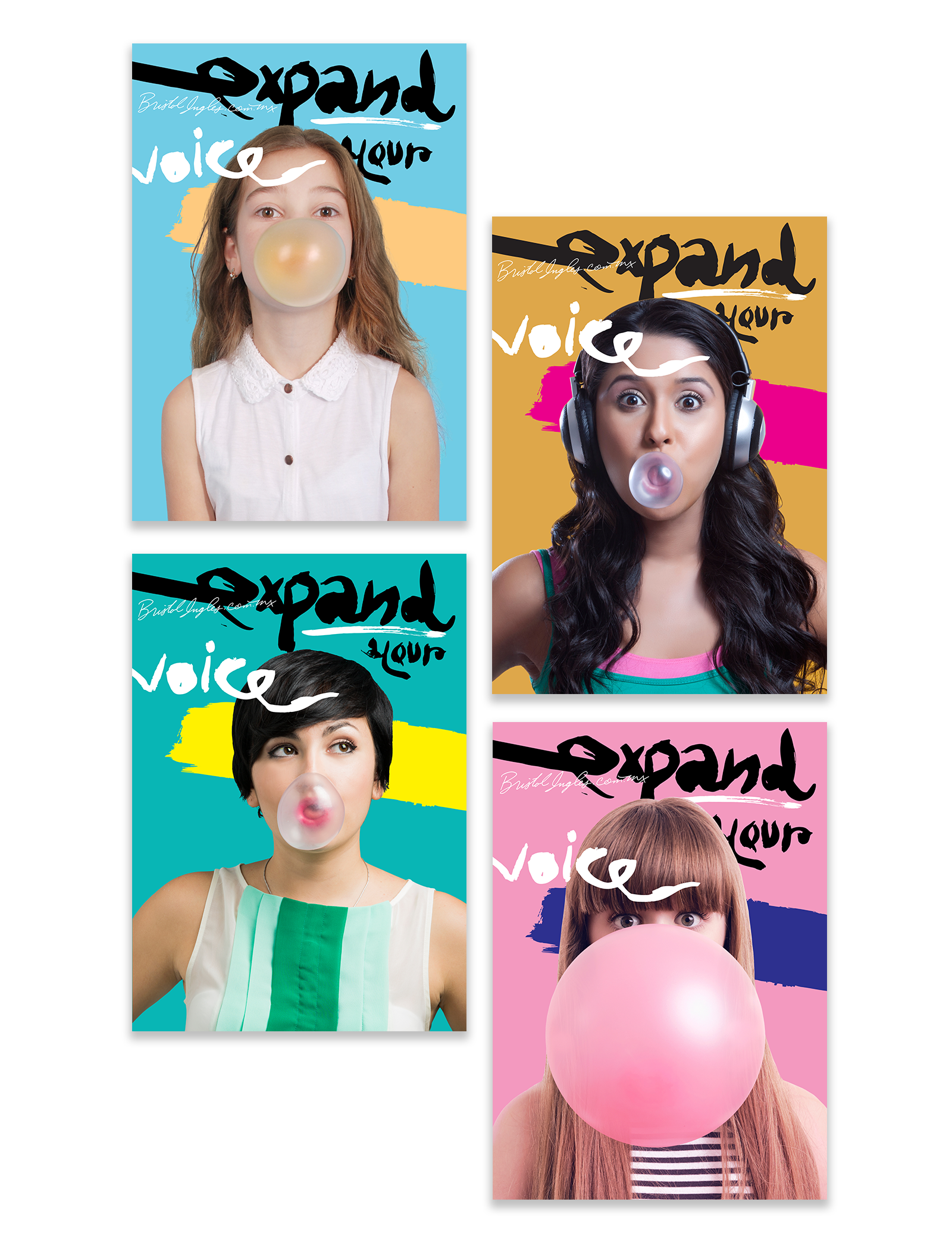
Having developed and established a visual language through the years, one of the first steps creating a new campaign was to push the boundaries of language, color, typography and art direction within the brand ethos. Every campaign exists around a single concept, the initial visual inspiration came from the expressive work of James Victore and an image of a girl blowing bubble gum. The action of blowing bubble gum inspire the concept of the “expanding speech bubble”, and after an exhausting exercise of copywriting, the final slogan was “Expand your voice”, this slogan englobes the concept of continuous change and development of a fuller version of the students.
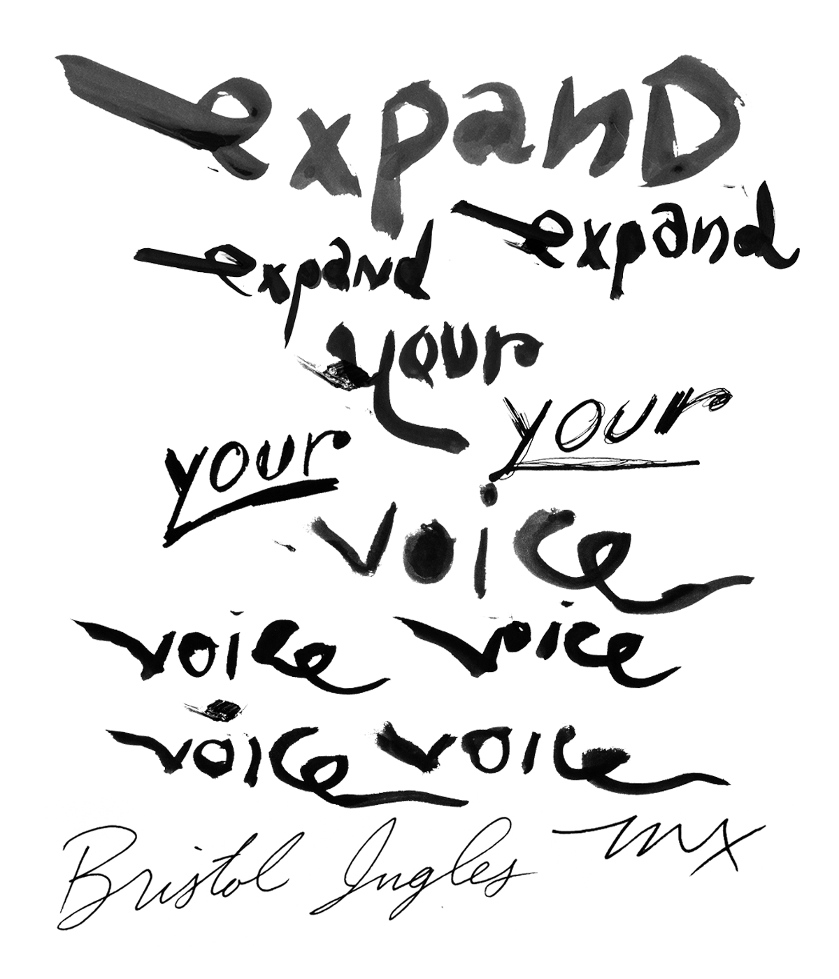
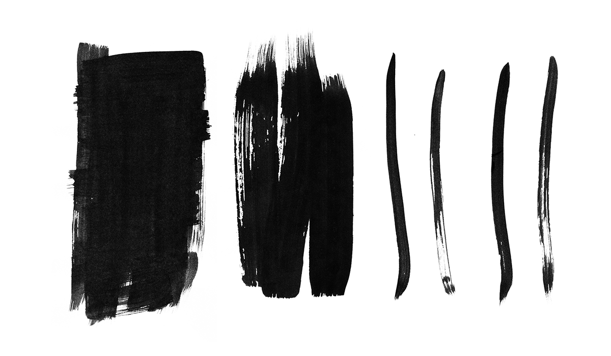
Lettering explorations
Recognition and Expressiveness
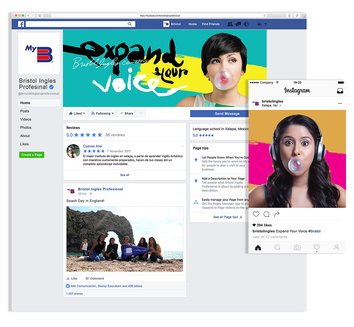
In a context where environments allow digital natives (Bristol’s most relevant market per age) to customize every aspect of their digital sharing experience (e.g. Snapchat, Instagram Stories), the use of lettering was almost a matter of common sense, it provided immediate recognition and expressiveness necessary to match the message energy, closing the circle and owning the concept across form and content, expanding and innovating Bristol’s visual vocabulary.
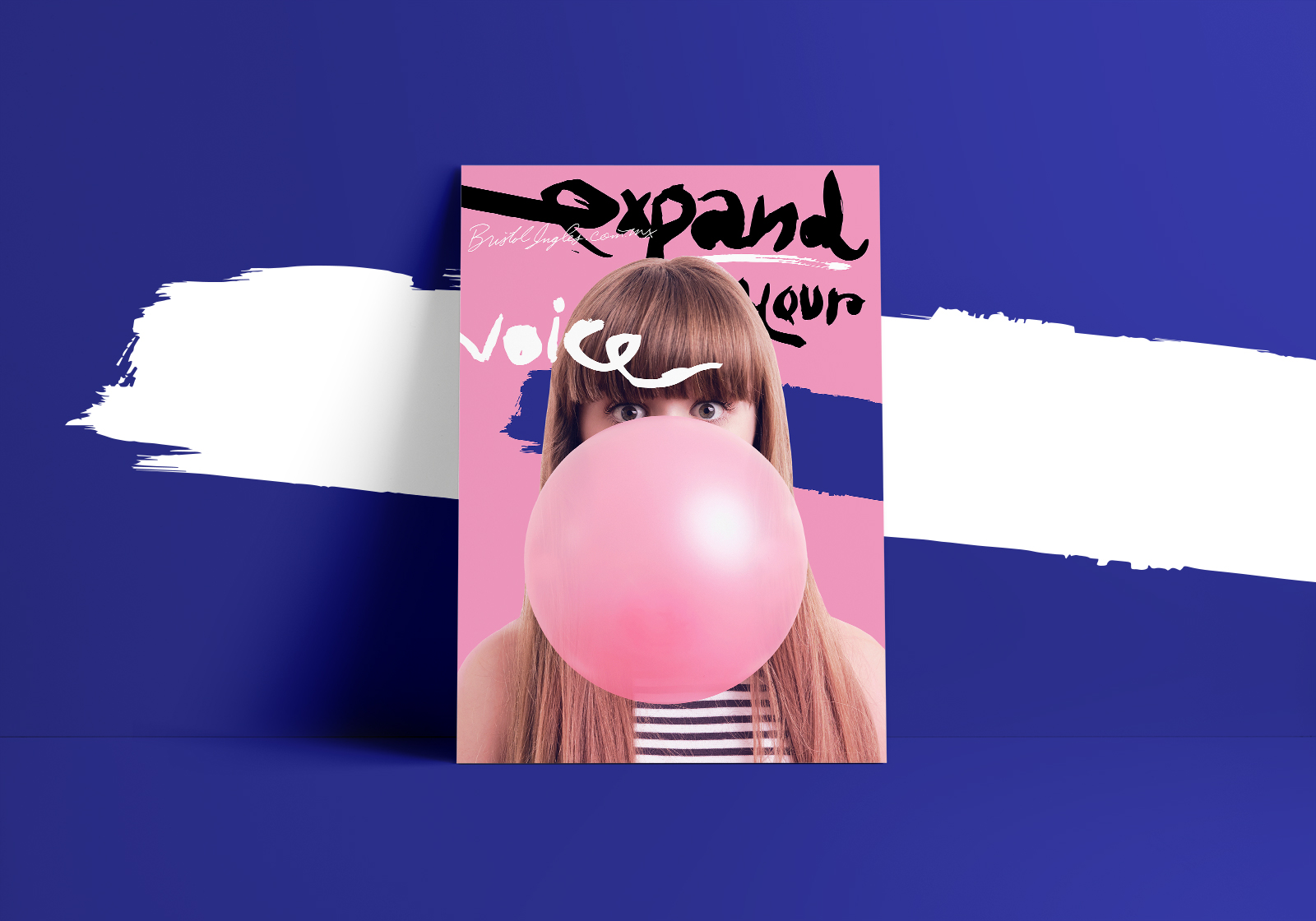
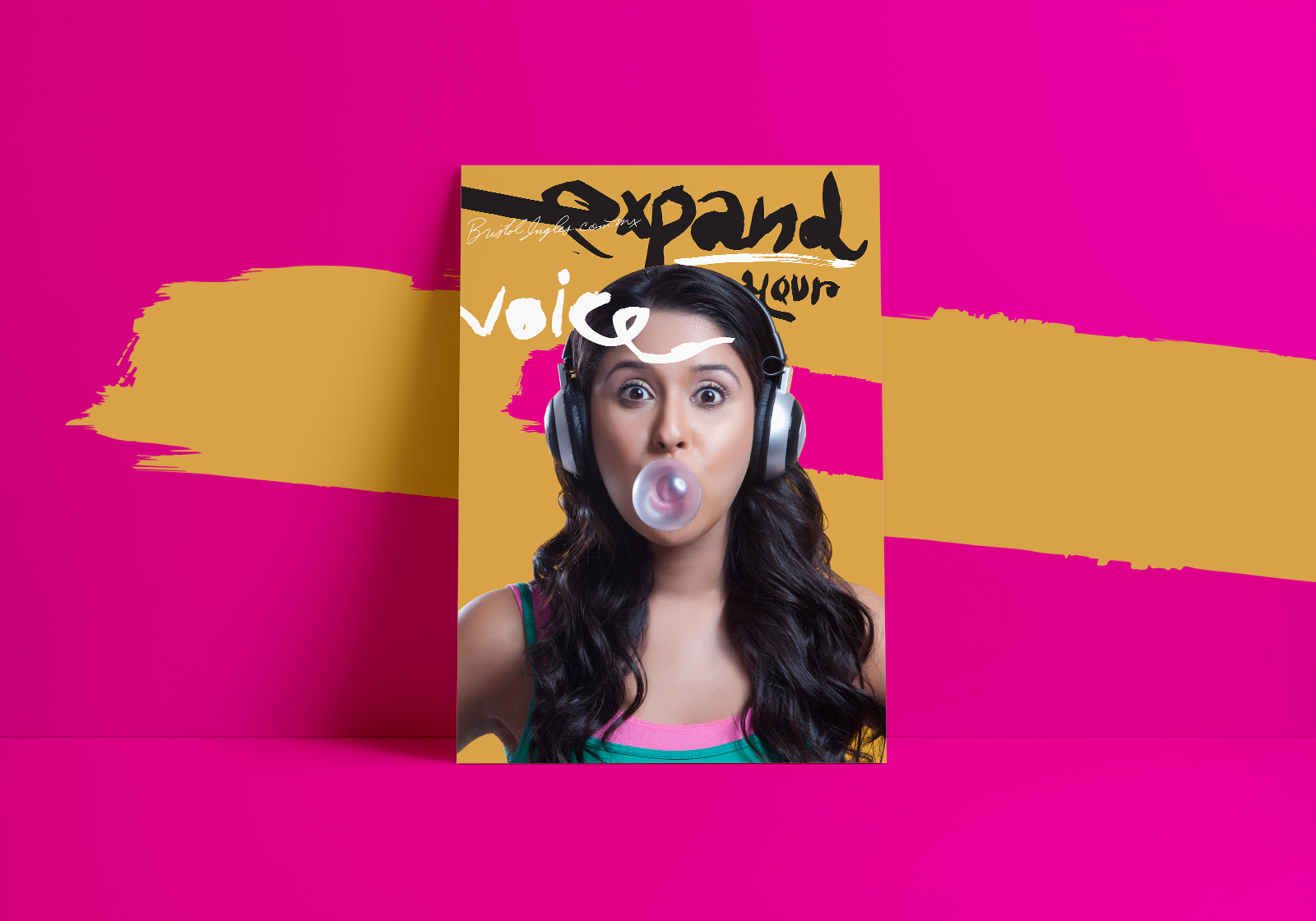
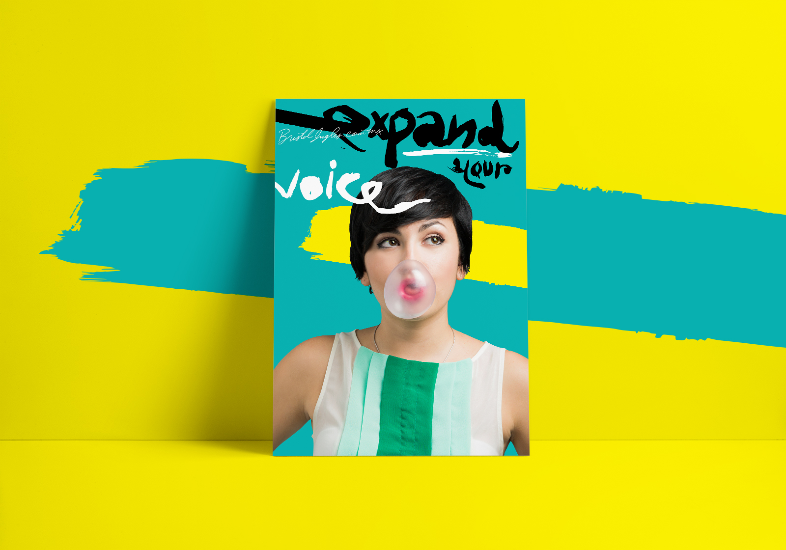
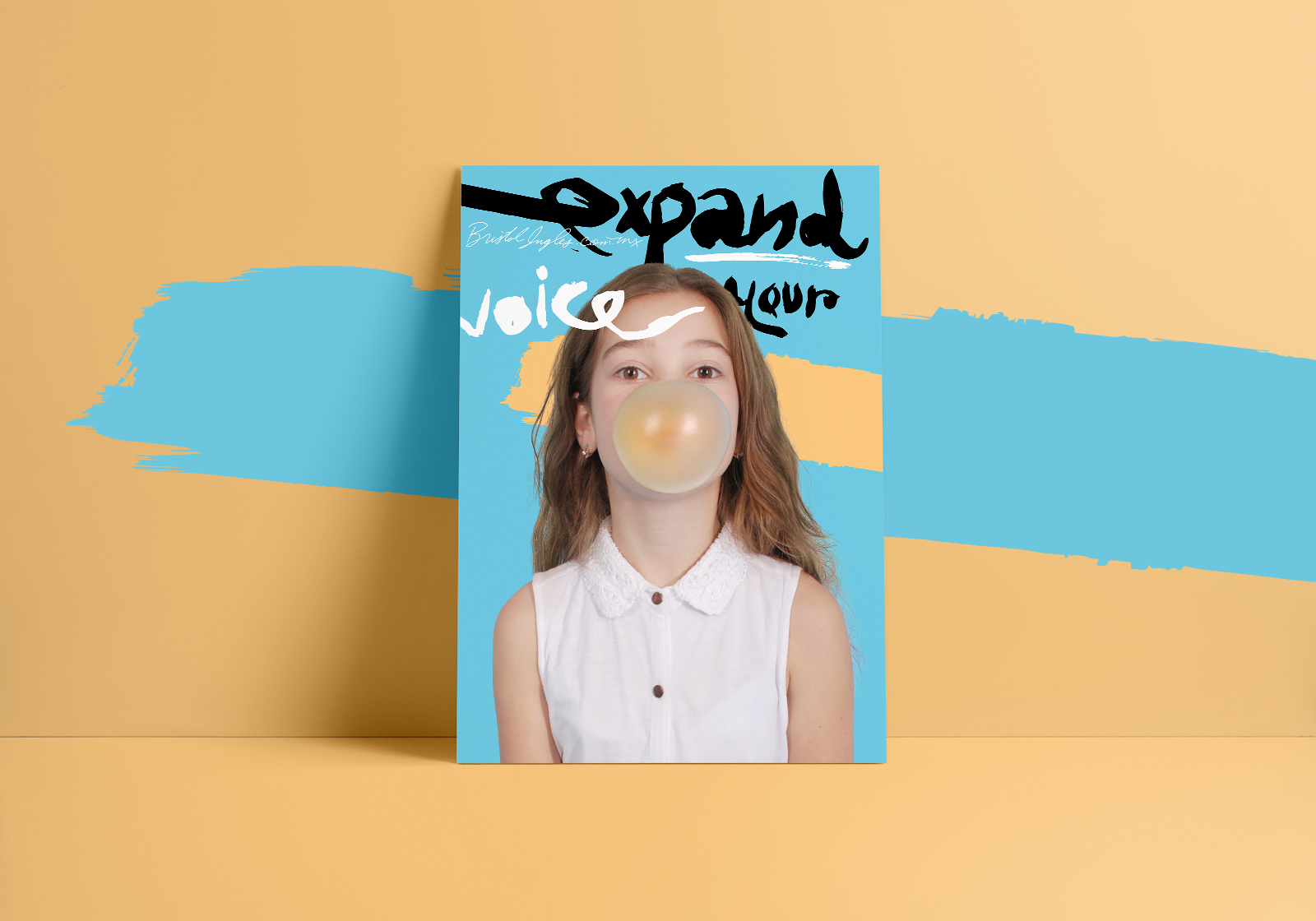
Speak Up
Since the beginning, focusing the campaign around girls as protagonists was the approach to follow. Bristol has more than 80% of female students, from little girls to professional women, this was the perfect opportunity to speak directly to them, leveraging a discourse that talks about diversity, empowerment and the potential of education as a tool of social mobility. Along these guidelines, the color was another main character; Bright, positive, playful, spontaneous, were some of the attributes that the new color palette introduces to the visual language of the company and also appealed to younger audiences. This was a 180 degrees shift for a company that has been using only 2 or 3 colors for its external and internal communication.
Although the campaign never intended to be political, having a female cast in the center of the conversation in a country where women are under aggression, added a subtle political overtone, not evident, but existent. The images created are inspirational and aspirational, encouraging us to speak up.